Monday 28 March 2011

Production Update

28/03/11

I've continued working on my double-page spread and newspaper ad in Photoshop.


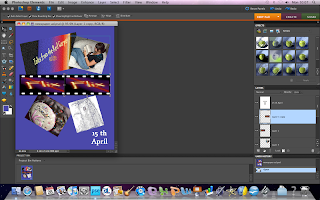
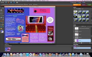
The above screenshots show the alterations I have made to my newspaper ad (left) and my magazine (right.)

I decided to make these alterations in order to improve the general look of my products. For example, I decided to lighten the background of the newspaper ad in order to make the images stand out more.

Friday 4 March 2011

Production Update

04/03/11

This screenshot shows the changes that I have made to my magazine double-page spread in Photoshop. I've made more room for the text, as many magazine double-page spreads
that I've seen have far more writing in them than I'd originally used in mine. I've also moved the adapted picture of the cinema, and changed the central image as I felt that the logo for the programme that the double-page spread focuses on looked more effective there, and I had already used the main logo for the website/TV channel at the top of the page. I moved the image to the centre of the two pages because it left more room to increase the amount of writing used, and many double-page spreads use images which cover a part of both pages.
I may change the position of some of the elements of the design further to improve how it looks, and I may also delete some parts of it, for example the writing in the peach colour, and replace it with other writing or an image.

Tuesday 1 March 2011

Research - Photoshop Tutorials

01/03/11


The above screenshots show my research into how to use Photoshop and what effects can be achieved through using it. I did this research before starting my newspaper advertisement and magazine double-page spread in Photoshop.
The first screenshot shows a website called photoshoproadmap.com which has links to different tutorials for Photoshop. These tutorials include the use of filters, such as the artistic, blur and sharpen filters, and how to do specific things in Photoshop, such as removing objects from the background of images. The second screenshot is of a tutorial linked to by this site, showing the removal of bins etc. from the background of a photograph.

Copyright

01/03/11

In order to avoid infringing copyright laws, the vast majority of the pictures that I have used so far are either my own photographs or pictures/logos that I have created with image software such as Photoshop and GIMP.
There are instances where I have adapted pictures from those found on websites which provide copyright free images, usually on the condition that the creator of the images is credited. I have adapted images in order to create two images on my magazine double-page spread. These images are -
film reel and popcorn (double-page spread) - Idea go / FreeDigitalPhotos.net
cinema screen (double-page spread) - Salvatore Vuono/FreeDigitalPhotos.net

more TV listings magazine research

01/03/11


I've decided to do more TV listings magazine research in order to help me better adapt and improve my current double-page spread.

These images are from the Radio Times TV listings magazine.

Between them, they give an impression of some of the codes and conventions of magazine double-page spreads. The image to the right shows a double-page spread focused on a TV programme hosted by James May. This particular article involves one large image on the right-hand side of the page, and the majority of the text on the left-hand side of the page. I think that this is quite effective, but may be less attractive to a teenage audience as it is not very colourful, and the image despite being large does not necessarily stand out as well as it could if the image were brighter, or if the layout were different.
I think that this double-page spread would be more attractive to a teenage audience, as the image is far more 'attention-grabbing', probably due to its central position on the page. It complies with the convention of these double-page spreads, which is that it uses a significant amount of text over the two pages, as well as attracting attention with an image. The variation in the colour of the word 'toff' in the title of this double-page spread also acts as a focus point on the page, as does the slang used in the title itself in contrast with the word 'toff' which is more associated with the upper-class rather than with slang.

The double-page spread on the right uses the conventions such as a lot of text, information about the programme being discussed, and the use of images. Again, the image is more centralised than that in the first double-page spread from this post, and I feel that this makes it stand out more. Portions of the text on the right-hand page of this double-page spread are split into numbered sections, which would perhaps be a good technique to use if I wanted to split several different points up on the page.