Sunday 8 May 2011

Evaluation - How did you use new media technologies in the construction and research, planning and evaluation stages?

08/05/11

Research and Planning

In terms of research and planning, the main technology which I used was the internet in order to do research into other websites, and guidelines into website design and usability such as that found on Jakob Nielsen’s website.
In order to present and organise my research and planning, I posted the research and planning which I did onto my blog. I used Blogger to compose my posts and insert images, and believe that the clear presentation of my blog allowed me to stay focussed on what I needed to do, and also allowed me to review my research during the production of my website, newspaper advertisement, and double-page spread.

Construction – Kompozer


As is shown by the screenshot above, the construction of my website was heavily dependant on technology. I constructed my website in Kompozer, which allowed me to design the layout through tables and cells, insert images, and embed videos. I also learnt how to insert hyperlinks in order to link the pages of my website together. This allowed me the means necessary in order to design a website in line with what I felt would appeal to teenage audience, whilst also considering codes and conventions.
I feel that, although I did experience some problems with the use of Kompozer, such as an issue with some hyperlinks, I was able to rectify these mistakes and problems.
I also used some basic source code in order to create the forum and games sign in pages, and I was happy with the results. Being able to create these sign in pages allowed me to develop the website design to include more conventions, such as the forum, which are attractive to teenagers.

Construction – Photoshop Elements

In order to construct my ancillary texts, I was reliant on Photoshop Elements. The use of Photoshop Elements allowed me to use layers to create my magazine double-page spread and newspaper advertisement. This helped me place images and text onto the pages, including placement in front of and behind other images etc. By merging layers I was able to create a single layer out of several, and this allowed me to move images that I wanted in a particular placement in relation to each other at the same time. This was particularly useful for my magazine double-page spread where I was working with a larger amount of space.
The use of filters in Photoshop also allowed me to alter my images in order to place more emphasis on them in certain places. This is exemplified in my newspaper advertisement where I used film grain filters on the images to increase the association of the brand with a teen film channel.
I also resized and altered images for my website in Photoshop. This allowed me to prepare the images to be exactly as I wanted them before importing them into my web pages.
In order to create images such as my logos (for the main site and the featured programme) I also used image software in the form of GIMP2 – I found this easier to use to make logos in than the Photoshop software due to the difference in features. The perspective feature allowed me to move the glow forward from the shadow more in my channel logo, as before I did this you could not see the shadow at all. I felt that the use of the shadow gave more depth to this logo.

Evaluation

In terms of my evaluation, I feel that the use of blogging has allowed me to clearly reflect on and present the evaluation.
I have also used screenshots and other images in order to make my evaluation more visual, and divided each question into different sections within the blog posts in order to make it more clearly readable, and keep the attention of the reader.

Evaluation - What have you learnt from your audience feedback?

08/05/11

In terms of audience feedback, I have received feedback in the form of strengths and weaknesses from a group of around ten friends of the same age as my target audience of teenagers. I asked an equal number of girls and boys to identify what they saw as strengths and weaknesses of my production work. Ideally, I would have asked a larger amount of people, but was limited in terms of time.
My audience feedback has shown me what I could have done to further improve my products, and also what my target audience found to be the good points and the bad points of my production work.

Website – Strengths

The strengths attributed to my website were varied; many of the people that I asked commented on my use of the video clip which I included, and several identified the forum and games sign in pages as useful in terms of including interactive content.
Girls tended to be more attracted to the colour scheme than boys, which was as I expected. In reflection, it would probably have been better to use a more neutral colour scheme, and less feminine colours such as purple and pink, in order to better attract a wider range of teenagers.
Most of the people asked identified my logo as one of the strengths of the website, as many thought that it stood out strongly. Three people commented on the aptness of the filmstrip feature of the logo for a film channel, and I feel this worked well.

Website – Weaknesses


The weaknesses identified were also varied. Some of the boys viewed the choice of colours as a weakness, as they were, in the words of one ‘a bit girly.’ As I’ve previously mentioned, in retrospect, it may have been more ideal to either alter the colour scheme or target the website more specifically at an audience of teenage girls.
A couple of people suggested that I should have used a video clip on the homepage of the site, or clearly provided a link to video clips. This shows the importance of the convention of video clips to teenagers, and I think that this is a good suggestion in terms of further attracting an audience. In terms of the ‘What’s on’ page (see screenshot above,) opinion was split over whether I had provided too much information, or too little. Some people felt that I should only have provided highlights on this page, and a few felt that I should have provided in-depth listings for more than one day. Despite this, I feel I probably did well in providing a balance between the two, with highlights for the week and in-depth listings for the day.

Ancillary Texts – Strengths

The strengths of my improved ancillary texts were identified clearly by many of the people which I asked.
The use of the light purple background of my newspaper advertisement was surprisingly seen as appropriate by several of the boys as well as the girls. This was seen as being due to the contrast between the background colours, and the other colours which I used, such as the darker colours in the images.
In terms of the newspaper advertisement, the comments also generally complemented the clear presentation of the information, such as the TV channel number, launch date etc. This shows the importance of clarity when using the convention of including details related to the product/service provided.
It was commented on that the variety of colour used in my magazine double-page spread made it seem very vibrant, although a few people didn’t feel that this was the case. The teenagers asked were also complimentary of the use of text on the page. It was mentioned that although there was a large use of text, the page was not unduly focused on the text itself. This possibly shows that teenagers prefer a scaling back of text, rather than the full amount suggested normally when using this convention.

Ancillary Texts – Weaknesses

One of the weaknesses of the ancillary texts was suggested as the layout of the magazine double-page spread. A few people thought that there was too much on the pages, and that it would have benefitted from being more simplistic. I can see where this viewpoint is coming from, and maybe the layout could perhaps have been a little more simplistic in order to be more focussed.
Another point made about this ancillary task was that the colour of the box surrounding the channel details etc. was again a little feminine for some of the boys. Again, it probably would have been better to more clearly aim the TV channel at teenage girls, or change the colours so that they were less feminine.
The main criticism established by those people that I asked regarding the newspaper advertisement was the placement of the logo; whilst everyone agreed that the logo was a necessary part of this product, some felt that the placement looked a little awkward. Others disagreed, but this possibly could have been rectified by moving the logo to a bottom corner.

Evaluation - How effective is the combination of your main product and ancillary tasks?

08/05/11

The combination of my main product with my ancillary tasks is a combination of a website with a newspaper advertisement and a magazine double-page spread. Each of the products is designed to accompany a new TV channel designed for teens called Flix. Whilst each is an individual product, they retain the same general feel and focus on the same themes and images in order to better compliment each other. The importance of a degree of unity between this product lies with the branding and marketing of the new TV channel.

Logo and images

The use of my channel logo (image on the right) is important to the branding of the products. I used the logo on each of the products, hopefully leading to an association in the minds of the audience.
I also used some of the same images on the different products, such as the logo for the featured show, but I did use this slightly differently on each product; I used it with an image of a cinema on the magazine double-page spread, and added a film grain filter to it on the newspaper advertisement.

Film Imagery

As the TV channel which my products are based on is a teen film channel, the use of imagery with connotations of film was also an important part of the branding of the product. It also would aid the TV channel in terms of marketing as the target audience, apart from being teenagers, would inevitably be teenagers who like to watch films. I ensured that each of my media products included some features with connotations of film.
In each of the products, as previously mentioned, I used my logo. The use of the filmstrip feature on each side of the logo helps to establish the brand as being associated with film.
In my website, apart from the logo, the biggest contributor to the development of an association with films is the film opening video clip which I embedded in the featured show page. This is a strong indication to the audience of the links between the TV channel and films.
In my double-page spread I used images such as the image of the cinema (Salvatore Vuono/FreeDigitalPhotos.net), which was used in conjunction with the logo for the featured show, and an image of popcorn combined with an image of film reel (both Idea Go/FreeDigitalPhotos.net.) These images clearly establish the theme of the product as that of film, via the connotations associated with them.
I also added a film grain filter to many of the images used in my newspaper advertisement in order to further enhance this association with film.

Details

I included several of the same details on different products in order to further enhance the cohesion between them.
This included details such as the launch date and sky channel found on both of my ancillary texts. The lack of contradiction between these details ensures that they are clear to the audience, and also that the two ancillary tasks are both associated with the same TV channel.
Other similarities in terms of details are the details found on my double-page spread regarding TV programmes, particularly the featured TV programme, and the details found on my website. I ensured that the details relating to the programmes corresponded to each other and did not contradict, allowing a unity and continuity to develop between the products which would be essential in terms of a real marketing campaign.

Evaluation - In what ways does your media product use, develop and challenge forms and conventions of real media?

08/05/11

Homepage


Websites have several forms and conventions. Above is a screenshot of my homepage; a common convention of websites is the use of a homepage as a means of entrance to the content of the website. This feature makes the website more usable and is a convention relied on by most website users in order to make the website more coherent and easier to navigate.

Navigation and Hyperlinks

As can be seen from the screenshot of my homepage, I used the convention of a navigation in my website. Navigations again aid the usability of the website by making it easier for the user to access the content they wish to find. I decided to use the convention in the form of a top navigation; top navigations were a feature noticeable amongst the websites aimed at my target audience which I analysed as part of my research, such as Kerrang! and Bliss. I felt that this aided my ability to construct the layout of the page.
Navigations would not work without hyperlinks. Hyperlinks allow the linking of pages within the website, and without them it would not be possible to move easily around the website. All websites with more than one page have hyperlinks to link the pages together, and I have used hyperlinks extensively throughout my website in order to link pages and allow the user to find the content that they want to access easily.

Forum and Interactive Content


A convention that is used in many websites is a forum; in my website, I created a sign in page (the construction of which is shown in a screenshot above) for a forum, just as I created a sign in page for the games page. I did not create a full forum page due to technical and time limitations, but I was able to include the forum as a feature of the design for my website. Forums and other interactive content were common features amongst the websites that I analysed as part of my research. Features such as this were also recommended for websites designed for teenagers by Jakob Nielsen’s website (http://www.useit.com/), so in making the decision to include the forum, for example, I was able to keep my target audience of teenagers in mind.

Images and Video Clips

Another convention of websites which is popular amongst teenagers is the use of images and video clips. I used original images throughout my website in order to illustrate the pages of the website, and provide visual examples of the programmes that my TV channel would offer. Images also aid the attraction of the audience to the page; this is also used in advertising, and I did use images throughout my ancillary texts which were a magazine double-page spread and newspaper advertisement.
I embedded a video clip into my featured show page. Many teenage websites include video clips in order to advertise upcoming TV programmes, or provide exclusive or new content, such as a new music video, or an interview which can only be seen on their website. The E4 website (http://www.e4.com/) has video clips of TV programmes for example, whilst the Kerrang! website (http://www.kerrang.com/) often has video clips of new music videos (for example the My Chemical Romance video on http://www.kerrang.com/blog/2011/03/watch_my_chemical_romances_new_1.html). I decided to use less text alongside the video clip than many websites use, and also decided to make the area the video took up quite big to increase its visibility and use it as a focus point of the page. Video clips add to the attraction of a teenage audience as the visual nature of video clips, as well as images, is attractive to a teenage audience and helps to keep the attention of this audience.

Ancillary Texts

In terms of my ancillary texts, I followed some of the codes and conventions of newspaper advertisements and magazine double-page spreads, as I had identified from my research. This included the use of images to attract the audience, the use of information about the product such as the launch date on the newspaper advertisement, and the use of large quantities of text used in double-page spreads to inform about specific programmes and other details of the channel. I found the use of these conventions important in terms of creating realistic and effective ancillary tasks.

Saturday 7 May 2011

Production Update

07/05/11

I've improved my double-page spread and newspaper advertisement to hopefully incorporate all the improvements that I planned to make, and also hopefully improve these ancillary texts further.

Thursday 5 May 2011

Planning - improvements to my ancillary texts

05/05/11

In order to improve my ancillary texts, particularly my newspaper ad, I plan to make these main changes -

Newspaper ad
- inclusion of more text e.g launch date, channel number, strapline etc
- improving the layout


Double-page spread
- potentially changing the colour of the text on the right-hand page
- emphasising other programmes on the TV channel more


I may also make other changes, but I think that these are most important in order to make the biggest improvements.

Friday 29 April 2011

Production update

29/04/11

I've made improvements to my website; the screenshots below show the progression of these improvements.
Above is a screenshot of improvements to the news page. I re-structured the layout of this page and the home page (see screenshot below) to improve the look of the website. I also decided to give background colours to the cells that made up the websites throughout the different pages.


Below are screenshots of work that I did to create a forum login page, including a screenshot of the code that I used to create this. This is very similar to work that I did to create the games login page.

Monday 11 April 2011

Planning - improvements to my website

11/04/10

In order to improve my website, I've planned some main points that I need to complete. Below is a list of these points.

Hompage
- neaten/change layout
- more text
-for example: channel number, what can be found on various pages of the website

What's On
- more links

Featured Show
- re-link from other pages in order to have the link on the full phrase not both words

The above are basic points that I plan to complete in order to improve my website, I hope to improve further after these first points are completed.

Monday 28 March 2011

Production Update

28/03/11

I've continued working on my double-page spread and newspaper ad in Photoshop.


The above screenshots show the alterations I have made to my newspaper ad (left) and my magazine (right.)

I decided to make these alterations in order to improve the general look of my products. For example, I decided to lighten the background of the newspaper ad in order to make the images stand out more.

Friday 4 March 2011

Production Update

04/03/11

This screenshot shows the changes that I have made to my magazine double-page spread in Photoshop. I've made more room for the text, as many magazine double-page spreads
that I've seen have far more writing in them than I'd originally used in mine. I've also moved the adapted picture of the cinema, and changed the central image as I felt that the logo for the programme that the double-page spread focuses on looked more effective there, and I had already used the main logo for the website/TV channel at the top of the page. I moved the image to the centre of the two pages because it left more room to increase the amount of writing used, and many double-page spreads use images which cover a part of both pages.
I may change the position of some of the elements of the design further to improve how it looks, and I may also delete some parts of it, for example the writing in the peach colour, and replace it with other writing or an image.

Tuesday 1 March 2011

Research - Photoshop Tutorials

01/03/11


The above screenshots show my research into how to use Photoshop and what effects can be achieved through using it. I did this research before starting my newspaper advertisement and magazine double-page spread in Photoshop.
The first screenshot shows a website called photoshoproadmap.com which has links to different tutorials for Photoshop. These tutorials include the use of filters, such as the artistic, blur and sharpen filters, and how to do specific things in Photoshop, such as removing objects from the background of images. The second screenshot is of a tutorial linked to by this site, showing the removal of bins etc. from the background of a photograph.

Copyright

01/03/11

In order to avoid infringing copyright laws, the vast majority of the pictures that I have used so far are either my own photographs or pictures/logos that I have created with image software such as Photoshop and GIMP.
There are instances where I have adapted pictures from those found on websites which provide copyright free images, usually on the condition that the creator of the images is credited. I have adapted images in order to create two images on my magazine double-page spread. These images are -
film reel and popcorn (double-page spread) - Idea go / FreeDigitalPhotos.net
cinema screen (double-page spread) - Salvatore Vuono/FreeDigitalPhotos.net

more TV listings magazine research

01/03/11


I've decided to do more TV listings magazine research in order to help me better adapt and improve my current double-page spread.

These images are from the Radio Times TV listings magazine.

Between them, they give an impression of some of the codes and conventions of magazine double-page spreads. The image to the right shows a double-page spread focused on a TV programme hosted by James May. This particular article involves one large image on the right-hand side of the page, and the majority of the text on the left-hand side of the page. I think that this is quite effective, but may be less attractive to a teenage audience as it is not very colourful, and the image despite being large does not necessarily stand out as well as it could if the image were brighter, or if the layout were different.
I think that this double-page spread would be more attractive to a teenage audience, as the image is far more 'attention-grabbing', probably due to its central position on the page. It complies with the convention of these double-page spreads, which is that it uses a significant amount of text over the two pages, as well as attracting attention with an image. The variation in the colour of the word 'toff' in the title of this double-page spread also acts as a focus point on the page, as does the slang used in the title itself in contrast with the word 'toff' which is more associated with the upper-class rather than with slang.

The double-page spread on the right uses the conventions such as a lot of text, information about the programme being discussed, and the use of images. Again, the image is more centralised than that in the first double-page spread from this post, and I feel that this makes it stand out more. Portions of the text on the right-hand page of this double-page spread are split into numbered sections, which would perhaps be a good technique to use if I wanted to split several different points up on the page.

Monday 28 February 2011

Production Update

28/02/11

I have been working on my magazine double-page spread in Photoshop as well as my newspaper advertisement.
I've been putting the double-page spread together with a mixture of pictures and writing. I think that generally it needs more writing in order to conform with the conventions of a double-page spread, and I plan to complete more research to help me improve it. In the screenshot to the right, I am adding more writing to the page, though more still needs to be added as there is still not a sufficient amount.
The screenshot to the left shows me adapting two images into one through the use of layers. The bottom picture of the cinema is from a copyright free image website, which I've credited on the page, and I think the effect of my logo in the cinema screen ties in with the film TV channel theme. I like this adapted image, and may keep it when I make changes to my double-page spread.

Production Update

28/02/11


I have been working on the newspaper ad to accompany my website/channel launch. I've been using Photoshop to work on my newspaper ad, and using the layers and filters available to create it.
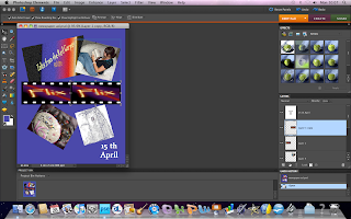
Above is a screenshot of my work in Photoshop. This was taken towards the end of the production of my newspaper ad, as I was putting in the text and tilting it. I decided to put 'Screening soon..' instead of more detailed text because I decided to complete the newspaper ad as if it was an early ad, with more to follow, and thought that the simple phrase would make people want to find out more.


Above is a screenshot of a zoom-in to show the filter that I used on many of the pictures. I used the filter that added film grain to the picture as it is a film channel, and I felt that this linked in with the theme. The screenshot does not show the effect to its full advantage, but does give a good overall impression of it.

Monday 10 January 2011

Update

10/01/11

I am currently continuing to work on my website using Kompozer; below are screenshots of the development of one of my website pages.